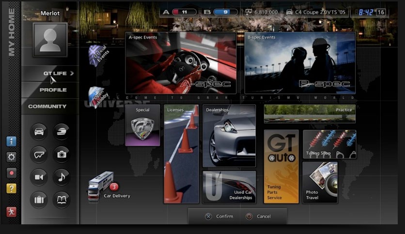
Gran Tursimo 5 Menu UI Redesign

Summary
This project was a complete UI/UX redesign of the GT Mode menu from Gran Turismo 5. The original menu felt overwhelming, cluttered, and unintuitive for new players. My goal was to modernize the interface by introducing a clean, consistent, and genre-appropriate design - one that better aligns with modern UX principles and sim racing aesthetics.
My Process
Identifying the Issues
The original GT Mode interface:
- Lacked structure and clarity
- Was unintuitive for new users
- Had poor visual hierarchy and navigational flow

Research
I conducted a comparative analysis of other sim racing games like:
- Forza Motorsport 5 - clean grid-based tile menu with clear visual cues
- Project CARS 2 - sharp, skewed elements evoking speed and competition
These examples helped shape my approach in both layout and visual theming.
Design Decisions
- Grid-based Tile System: Inspired by Forza, I introduced a simplified tile layout that makes navigation faster and more intuitive.
- Categorized Menu Layout: I split GT Mode into three core categories to reduce screen clutter and make options easier to locate.
- Racing-Themed Visuals: Leveraged sharp edges, bold fonts, and speed-inspired imagery to reflect the sim racing genre.
- Cover Image Buttons: Each menu tile features themed background art relevant to its function, improving visual context.
Outcome
The final prototype was built and tested in Figma, with:
- Improved clarity and structure
- More intuitive navigation
- Stronger thematic consistency with the racing genre
I truly believe I’ve reached my goal of improving the game’s interface and implemented the design thoroughly.
Self-Reflection
What Went Well:
- Extensive research and planning contributed to a well-organized, genre-appropriate redesign.
- Clear categorization and visual hierarchy made the menu easier to use and more immersive.
What I’d Improve:
- Readability of button text: The stroked text effect clashed with certain background images, making some tiles hard to read from a distance.
In the future, I would explore alternate text treatments or add dynamic contrast overlays for better legibility.
Skills
- User Interface Layout
- User Experience Optimization
- Thematic Consistency
- Figma Prototyping